

7 Critical Data Visualization Mistakes Sabotaging Algorithmic Trading Strategies
Discover the most common data visualization mistakes in algorithmic trading that ruin backtests and live performance. Learn practical fixes with Python examples using Matplotlib and Plotly.
Imagine pouring weeks into coding a promising mean-reversion strategy in Python, only to watch it deliver mediocre results in live trading. The backtest looked spectacular on your screen — a smooth equity curve climbing steadily upward. Yet reality disagreed.
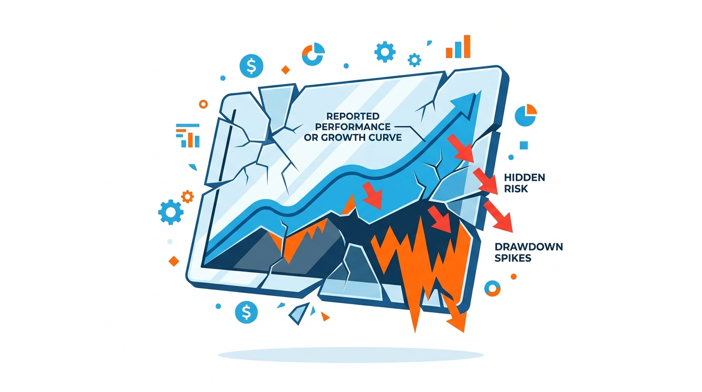
The culprit? Often, it's not the strategy logic itself, but how you visualized the data. Poor visualizations hide risks, exaggerate performance, and lead to overconfident decisions that cost real capital.
In algorithmic trading, data visualization is your bridge between raw numbers and actionable insight. It helps you spot patterns, validate hypotheses, and communicate strategy behavior. But small mistakes can create dangerously misleading pictures.
In this comprehensive guide, you'll learn the most damaging visualization errors beginner to intermediate algo traders make, why they matter for strategy development and risk management, and exactly how to avoid them using practical Python code.
Why Data Visualization Matters More Than You Think
Effective visualization isn't just about pretty charts — it's a core part of quantitative analysis. It reveals overfitting, highlights regime shifts, and exposes hidden correlations that summary statistics alone miss.
Ignoring proper visualization practices often leads to:
- False confidence in backtested performance
- Missed opportunities to improve risk-adjusted returns
- Difficulty diagnosing why a strategy fails in production
Let's dive into the mistakes that silently undermine many trading systems.
Mistake 1: Overplotting — When Your Charts Become Unreadable Noise
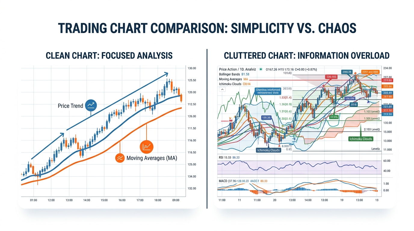
Have you ever stared at a price chart with dozens of indicators layered on top and felt completely overwhelmed?
This is overplotting, and it's one of the most frequent issues in trading dashboards. Adding every technical indicator — RSI, MACD, Bollinger Bands, moving averages, volume — creates visual chaos.
Why It Hurts Trading Systems
You miss critical price action and subtle regime changes. Overloaded charts make it harder to validate entry/exit signals during backtesting.
How to Fix It: Layering and Selective Visualization
Start simple. Focus on price action first, then add one or two complementary indicators.
1import pandas as pd
2import matplotlib.pyplot as plt
3import numpy as np
4
5# Assume df is your OHLC data with indicators pre-calculated
6fig, (ax1, ax2) = plt.subplots(
7    2, 1, figsize=(12, 8), gridspec_kw={'height_ratios': [3, 1]}
8)
9
10# Price and key indicators on primary axis
11ax1.plot(df.index, df['Close'], label='Close Price', color='blue', linewidth=2)
12ax1.plot(df.index, df['SMA_50'], label='50-day SMA', color='orange', alpha=0.8)
13ax1.plot(df.index, df['SMA_200'], label='200-day SMA', color='red', alpha=0.8)
14
15ax1.set_title('Clean Price Action with Key Moving Averages')
16ax1.legend()
17ax1.grid(True, alpha=0.3)
18
19# Volume subplot
20ax2.bar(df.index, df['Volume'], color='gray', alpha=0.6)
21ax2.set_ylabel('Volume')
22
23plt.tight_layout()
24plt.show()
What this code does: It creates a two-panel chart separating price from volume, using clear colors and minimal overlays.
Trading implication: The cleaner view makes it easier to spot golden cross signals or divergence without distraction. In live trading, this clarity reduces hesitation and improves execution discipline.
Mistake 2: Using Linear Scales for Non-Linear Market Data
Why does your equity curve look deceptively smooth while real drawdowns feel catastrophic?
Many traders plot returns or prices on linear scales, ignoring the multiplicative nature of markets. A 50% loss requires a 100% gain to recover — something linear charts obscure.
The Math Behind Proper Scaling
Use logarithmic scales or plot percentage returns for better insight. This transforms multiplicative processes into additive ones, making volatility and drawdowns more visible.
1# Comparing linear vs log scale equity curves
2fig, (ax1, ax2) = plt.subplots(1, 2, figsize=(14, 6))
3
4# Linear scale (misleading)
5ax1.plot(equity_curve.index, equity_curve['Equity'], color='green')
6ax1.set_title('Linear Scale Equity Curve')
7ax1.set_ylabel('Account Balance ($)')
8
9# Log scale (truthful)
10ax2.plot(equity_curve.index, equity_curve['Equity'], color='green')
11ax2.set_yscale('log')
12ax2.set_title('Log Scale Equity Curve — Reveals True Risk')
13ax2.set_ylabel('Account Balance ($) — Log Scale')
14
15plt.tight_layout()
16plt.show()
Output explanation: The log scale version highlights periods where the strategy suffered proportionally large losses, even if absolute dollar amounts were smaller early on. This prevents underestimating risk in growing portfolios.
Real-world context: During the 2022 bear market, many traders using linear charts underestimated volatility clustering until it was too late.
Mistake 3: Ignoring Drawdowns and Focusing Only on Total Return
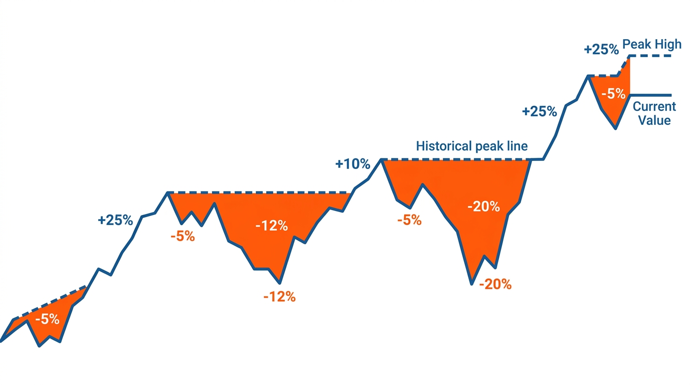
What if your "profitable" strategy actually had multiple 40%+ drawdowns that would wipe out most retail accounts?
Equity curves without maximum drawdown (MDD) visualization hide the emotional and capital toll of trading.
Key Formula
Visualizing Underwater Periods
1# Calculate and plot drawdown
2equity = df['Equity']
3peak = equity.cummax()
4drawdown = (equity - peak) / peak * 100
5
6plt.figure(figsize=(12, 6))
7plt.plot(drawdown.index, drawdown, color='red', linewidth=2)
8plt.fill_between(drawdown.index, drawdown, 0, color='red', alpha=0.3)
9plt.title('Strategy Drawdown Profile (%)')
10plt.ylabel('Drawdown %')
11plt.axhline(y=-20, color='orange', linestyle='--', label='Critical Threshold')
12plt.legend()
13plt.grid(True, alpha=0.3)
14plt.show()
This visualization immediately shows risk concentration and recovery times — crucial for position sizing and risk management.
Mistake 4: Cherry-Picking Time Periods and Survivorship Bias
Does your backtest only show the best 3-year window while ignoring the full market cycle?
Selective visualization creates false narratives. Always show the full history with clear annotations for major events.
1import plotly.graph_objects as go
2from plotly.subplots import make_subplots
3
4fig = make_subplots(
5    rows=2, cols=1, shared_xaxes=True,
6    vertical_spacing=0.1,
7    row_heights=[0.7, 0.3]
8)
9
10fig.add_trace(go.Candlestick(
11    x=df.index,
12    open=df['Open'], high=df['High'],
13    low=df['Low'], close=df['Close']
14), row=1, col=1)
15
16fig.add_trace(go.Bar(
17    x=df.index, y=df['Volume'], name='Volume'
18), row=2, col=1)
19
20fig.update_layout(
21    title='Interactive Full-History Candlestick Chart',
22    xaxis_rangeslider_visible=True,
23    height=700
24)
25
26fig.show()
Why it matters: Interactive tools like Plotly encourage exploration of the entire dataset, not just the curated window that looks best.
Mistake 5: Poor Color Choices and Accessibility Issues
Using red/green without considering colorblind users can mislead both you and anyone reviewing your work. Approximately 8% of men have some form of color vision deficiency.
Best practices:
- Use high-contrast palettes (blue/orange instead of red/green)
- Leverage colorblind-safe libraries like
seaborn'scolorblindpalette - Add texture or pattern to differentiate data series, not just color
- Always include clear labels and legends
1import seaborn as sns
2
3# Use a colorblind-friendly palette
4sns.set_palette('colorblind')
Mistake 6: Static Charts Instead of Interactive Dashboards
Modern algo trading benefits enormously from interactivity. Static PNGs can't answer follow-up questions like "what happened during this drawdown?" or "show me only Q4 2024."
Tools to consider:
| Tool | Best For |
|---|---|
| Plotly | Interactive candlestick, line, and scatter charts |
| Dash | Full trading dashboards with Python |
| Bokeh | Streaming real-time data visualization |
| Grafana | Infrastructure and system monitoring |
Mistake 7: Forgetting to Visualize Strategy Metrics Holistically
A single equity curve is not enough. Combine multiple views for a complete picture:
- Equity curve — overall performance trajectory
- Drawdown profile — risk and recovery periods
- Monthly returns heatmap — seasonality and consistency
- Trade distribution histogram — win/loss patterns
- Rolling Sharpe ratio — stability of risk-adjusted returns
Monthly Returns Heatmap Example
1import seaborn as sns
2
3plt.figure(figsize=(12, 8))
4sns.heatmap(
5    monthly_returns, annot=True, cmap='RdYlGn',
6    center=0, fmt='.1%'
7)
8plt.title('Monthly Returns Heatmap — Seasonality and Consistency Check')
9plt.show()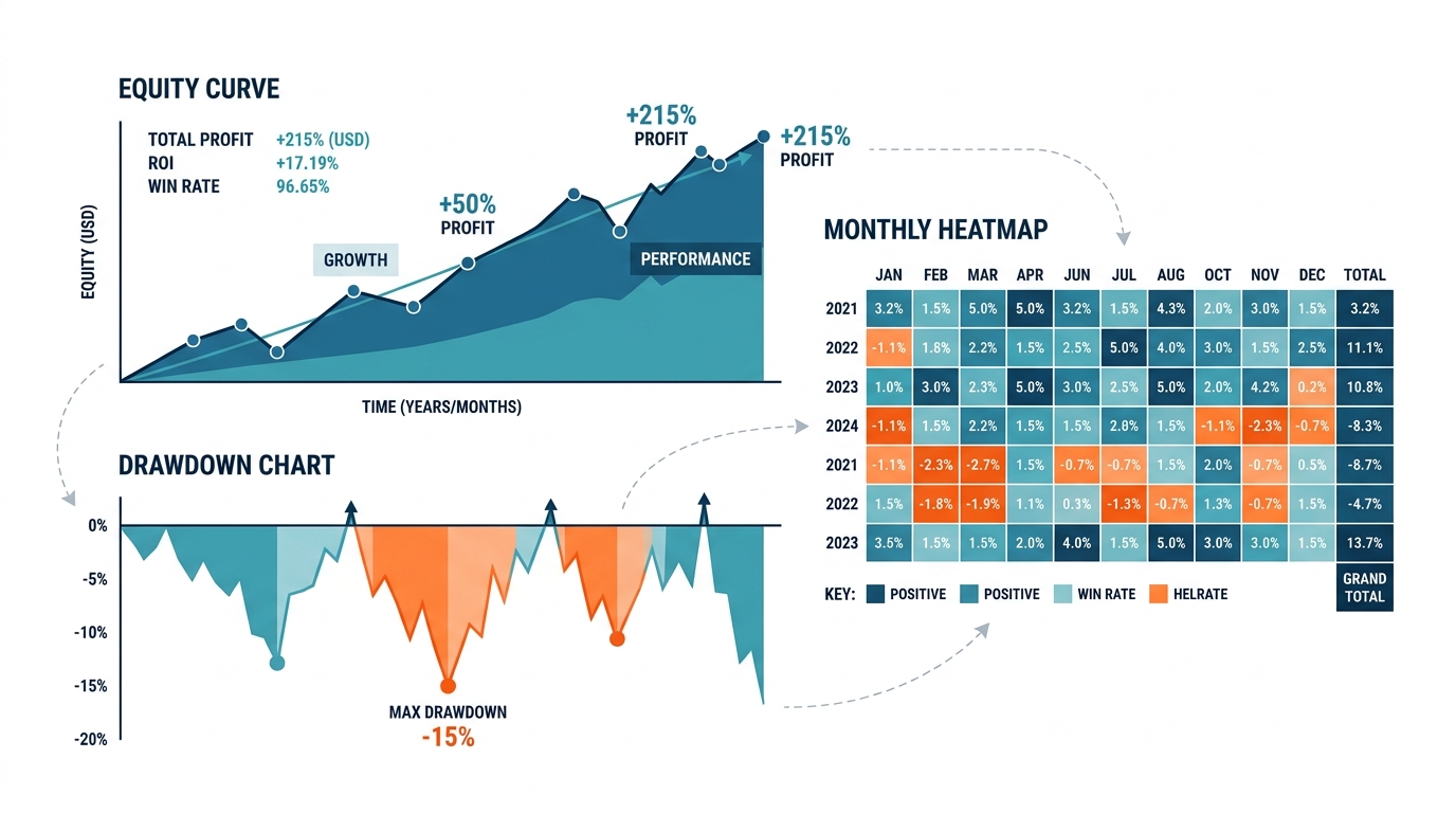
Best Practices for Professional Trading Visualizations
- Always start with price action — add indicators gradually
- Use appropriate scales — log for prices and equity curves
- Show full context with annotations for major market events
- Prioritize clarity over complexity — if it doesn't add insight, remove it
- Make it interactive when possible (Plotly, Dash, Bokeh)
- Visualize drawdowns prominently — they matter more than returns
- Use colorblind-safe palettes and include labels
Key Takeaways
- Clean visualizations prevent costly overconfidence and hidden risk exposure
- Log scales and dedicated drawdown charts reveal the true risk profile of any strategy
- Interactive tools encourage full-dataset exploration, reducing cherry-picking bias
- A holistic dashboard — equity, drawdowns, heatmaps, distributions — tells the complete story
- Audit your existing charts today: are they hiding something you need to see?
Conclusion
Data visualization mistakes directly impact your bottom line. A misleading chart doesn't just look bad — it leads to bad decisions, oversized positions, and blown accounts. Audit your charts today, apply these principles, and build visualization practices that make your trading systems more transparent, more robust, and ultimately more profitable.
Stay curious and keep visualizing clearly.